The Varied Palettes of Innovation
Color theory is a body of practical guidance to color mixing and the visual effects of specific color combinations. It has been used by artists and designers for centuries to create aesthetically pleasing and effective works. At its core, color theory involves the study of how colors interact with each other and how they can be combined to produce various effects. This includes understanding primary, secondary, and tertiary colors, as well as concepts like the color wheel, color harmony, and the emotional and psychological impacts of colors.
Fundamental Concepts of Color Theory in AI
The primary colors are red, blue, and yellow. These colors cannot be created by mixing other colors and serve as the foundation for creating all other colors. Secondary colors are created by mixing two primary colors: green (blue and yellow), orange (red and yellow), and purple (red and blue). Tertiary colors are formed by mixing a primary color with a secondary color, resulting in hues like red-orange and blue-green.
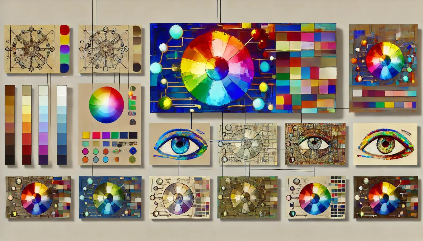
The color wheel is a circular diagram of colors arranged by their chromatic relationship. It is a fundamental tool in color theory, providing a visual representation of how colors relate to one another. The wheel helps artists understand how to mix colors and how different colors can be combined to create harmony or contrast.
Color harmony refers to the aesthetically pleasing arrangement of colors. There are several color harmony principles, including complementary colors (opposite each other on the color wheel), analogous colors (next to each other on the color wheel), and triadic colors (three colors evenly spaced around the color wheel). These principles help artists and designers create balanced and visually appealing compositions.
Colors also have psychological effects and can evoke different emotions and responses. For example, red is often associated with passion and energy, blue with calmness and stability, and yellow with happiness and warmth. Understanding these associations allows artists to use color to enhance the emotional impact of their work.
Integrating Color Theory with AI Art
AI-generated art leverages algorithms and neural networks to create images, often incorporating principles of color theory to produce aesthetically pleasing results. By training on vast datasets of existing artworks, AI systems learn patterns and relationships between colors, enabling them to generate new artworks that adhere to established color theory principles.
One common method used in AI art is Generative Adversarial Networks (GANs), where two neural networks – the generator and the discriminator – work together to create realistic images. The generator creates images, and the discriminator evaluates them, providing feedback to improve the quality of the generated images. This iterative process helps the AI learn to produce images that not only look realistic but also follow color harmony rules and evoke desired emotional responses.
Another technique is style transfer, where an AI model applies the color and style of one image to another. For instance, the style of a Van Gogh painting can be transferred to a photograph, blending the colors and brushstrokes of the painting with the content of the photo. This method relies heavily on understanding and replicating the color choices of the original artwork to create a harmonious and impactful result.
AI can also be used to explore new and innovative color combinations that may not be immediately apparent to human artists. By analyzing large datasets and experimenting with different algorithms, AI can suggest unconventional but aesthetically pleasing color palettes, pushing the boundaries of traditional color theory.
In practical applications, AI tools can assist designers and artists in choosing colors that work well together, enhancing their creative process. For example, Adobe’s AI-powered tools can recommend color palettes based on user input, streamlining the design process and ensuring that the final product adheres to color theory principles.
Primary, Secondary, and Tertiary Colors
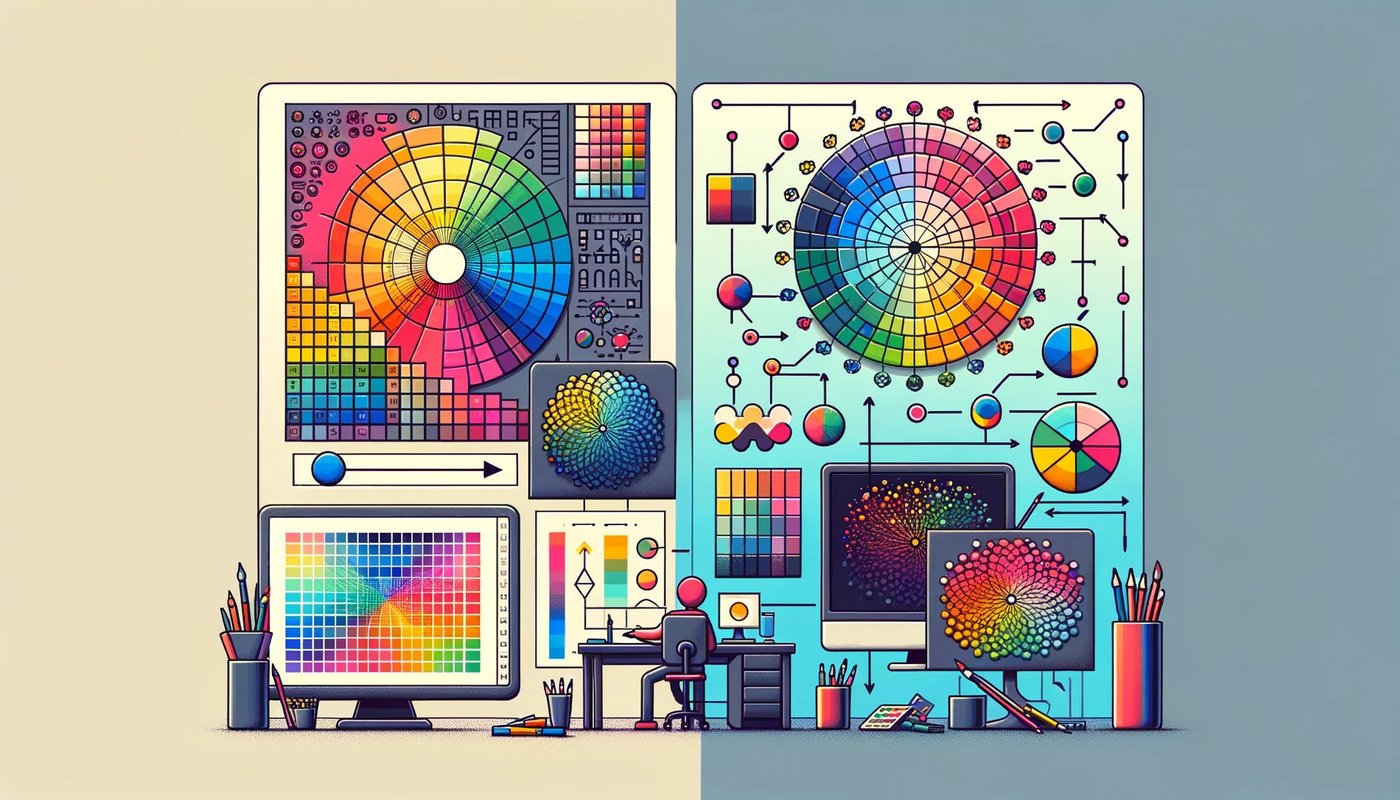
As mentioned, colors are categorized into three main groups: primary, secondary, and tertiary colors. These categories help in understanding how colors interact, blend, and are used in various applications, including AI-generated art.
Primary Colors: These are the fundamental colors that cannot be created by mixing other colors. In traditional color theory, the primary colors are red, blue, and yellow. These colors serve as the building blocks for creating other colors.
Examples:
- Red (R)
- Blue (B)
- Yellow (Y)
Secondary Colors: These are colors formed by mixing two primary colors in equal proportions. The secondary colors in traditional color theory are green, orange, and purple.
Examples:
- Green (G) = Blue + Yellow
- Orange (O) = Red + Yellow
- Purple (P) = Red + Blue
Tertiary Colors: These are created by mixing a primary color with a secondary color. Tertiary colors often have more complex names, such as red-orange, yellow-green, and blue-purple.
Examples:
- Red-Orange (RO) = Red + Orange
- Yellow-Green (YG) = Yellow + Green
- Blue-Purple (BP) = Blue + Purple
How AI Learns and Generates Primary, Secondary, and Tertiary Colors
AI models, particularly those used in art generation, learn to use and generate colors through training on large datasets. These datasets contain millions of images with various color combinations, which the AI analyzes to understand how colors are typically used and combined.
- Training Datasets: AI models are trained on diverse datasets that include a wide range of images with different color schemes. These images help the AI learn the relationships between primary, secondary, and tertiary colors. For example, an AI might be trained on a dataset of paintings, photographs, and digital art, where it learns how different colors are blended and used in different contexts.
- Color Blending Techniques: The AI learns color blending by analyzing how colors transition and mix in the training images. This involves understanding the RGB (Red, Green, Blue) color model commonly used in digital images. The AI processes the pixel values of images to learn how primary colors combine to form secondary and tertiary colors. For instance, by learning the RGB values for red and blue, the AI can generate the color purple through additive blending.
- Generating Colors: Once trained, the AI can generate new images using its understanding of color theory. When creating an image, the AI selects colors based on the learned relationships between primary, secondary, and tertiary colors. For example, if tasked with creating a sunset scene, the AI might use a palette of red, orange, and yellow, blending them smoothly to produce a realistic and aesthetically pleasing image.
Practical Applications
- Art and Design: AI can assist artists in creating color palettes for digital paintings, ensuring harmonious color schemes by automatically generating primary, secondary, and tertiary colors.
- Image Editing: Tools powered by AI can adjust colors in photographs to enhance visual appeal, using learned color relationships to balance hues and tones.
- Content Creation: AI-generated content, such as graphics and animations, can utilize sophisticated color blending techniques to produce vibrant and dynamic visuals.

The Color Wheel and AI
The color wheel is a fundamental tool in color theory, illustrating the relationships between colors. It is typically divided into segments representing primary, secondary, and tertiary colors. Understanding the color wheel helps artists and designers create harmonious color schemes and achieve the desired visual effects. The use of the color wheel is not limited to human artists; AI models also leverage this tool to generate aesthetically pleasing images.
The color wheel, divided into primary, secondary and tertiary colors, organizes the colors in a circular format, showing the relationships between them. The wheel helps in understanding color harmony, contrast, and the relationships between different hues. Color harmony refers to aesthetically pleasing combinations of colors, often achieved by using colors that are spaced evenly around the wheel (e.g., complementary, split-complementary, triadic, tetradic schemes).
AI models trained in image generation use the principles of the color wheel to create visually appealing artwork. These models are trained on large datasets of images, learning the relationships and harmony between colors through exposure to various artworks and photographs. Here’s how AI incorporates the color wheel into its processes:
- Color Selection: When generating an image, AI models use the color wheel to select colors that complement each other. For instance, if the AI is tasked with creating an image with a warm atmosphere, it will choose colors like red, orange, and yellow, which are adjacent on the color wheel and create a harmonious effect.
- Color Harmony: AI algorithms analyze the color relationships on the wheel to create balanced and harmonious color schemes. For example, when generating a landscape image, the AI might use a complementary color scheme (colors opposite each other on the wheel) to enhance visual interest, such as blue skies contrasted with orange sunsets.
- Color Contrast: To make certain elements of an image stand out, AI models use the principles of color contrast. This involves selecting colors from opposite sides of the wheel to create a striking visual effect. For example, an AI generating a graphic design might use a blue background with yellow text to ensure high readability and visual impact.
Algorithms for Color Harmony and Contrast
Several algorithms help AI models achieve color harmony and contrast, ensuring the generated images are visually appealing:
- Complementary Colors: Algorithms can identify complementary colors on the wheel to create contrast and make elements stand out. For example, in an AI-generated poster, using a blue and orange color scheme can draw attention to key areas.
- Analogous Colors: AI can use analogous color schemes, which involve colors next to each other on the wheel, to create serene and comfortable designs. This is often used in AI-generated nature scenes or background designs, where colors like green, yellow, and blue create a harmonious effect.
- Triadic Colors: Triadic schemes use three colors evenly spaced around the color wheel. AI employs these schemes to generate vibrant and balanced images, ensuring that no single color dominates the palette. For instance, a triadic scheme of red, blue, and yellow can be used to create dynamic and colorful art.
- Split-Complementary Colors: This approach uses a base color and two adjacent tertiary colors. AI uses this scheme to create high-contrast and less tension than direct complementary schemes, making it ideal for AI-generated infographics and illustrations where clarity is crucial.
- Tetradic Colors: Tetradic or double-complementary schemes use four colors arranged into two complementary pairs. AI can utilize this complex scheme to create rich and diverse palettes, useful in detailed illustrations and dynamic visual content.
Analogous Colors
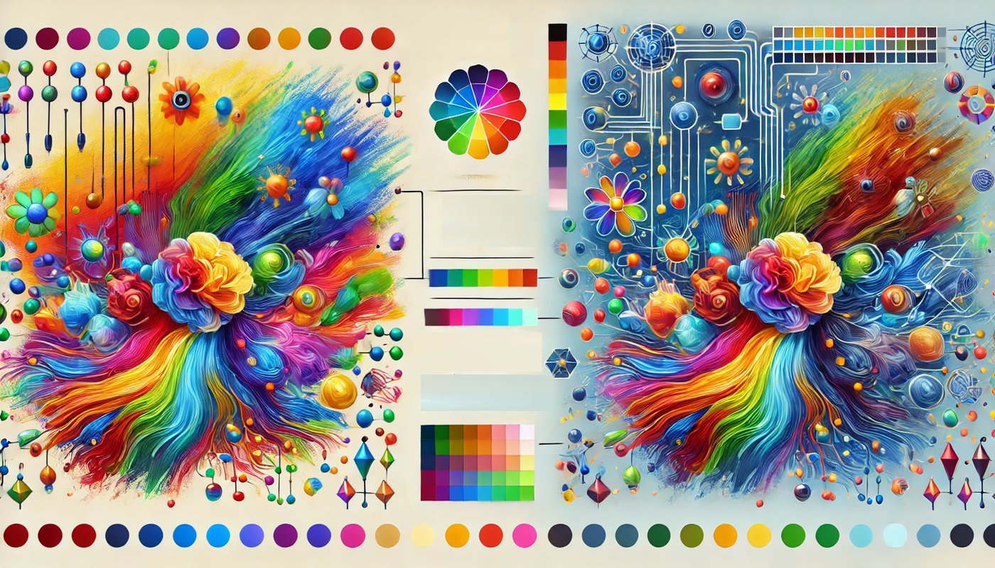
Analogous colors are groups of colors that are next to each other on the color wheel. Typically, these include three colors that sit beside each other, sharing a common hue. For instance, blue, blue-green, and green are considered analogous colors. This close relationship between colors creates a harmonious and pleasing effect, often used in art and design to establish a cohesive look.
Analogous colors are crucial because they create a sense of harmony and unity in art. By using colors that are visually related, artists and designers can produce a calming and aesthetically pleasing effect. This approach is often seen in nature, such as the transition of colors in a sunset or the varying shades of green in a forest. The subtle shifts in hue provide a soothing visual experience, making analogous color schemes ideal for creating balanced and harmonious compositions.
AI identifies and applies analogous color schemes through sophisticated algorithms that analyze and mimic human color perception. During the training phase, AI models are fed vast amounts of data, including images and artworks featuring various color schemes. These models learn to recognize patterns and relationships between colors, allowing them to generate new images with analogous color schemes effectively.
AI employs several techniques to identify and apply analogous color schemes. One method involves analyzing the hue values of pixels in an image and identifying clusters of colors that are close to each other on the color wheel. By understanding these relationships, AI can generate images that adhere to analogous color principles, ensuring a harmonious blend of colors.
In practical applications, AI can assist artists and designers by suggesting analogous color palettes that match their creative vision. For instance, an AI-powered design tool might recommend a palette of blues and greens for a landscape painting, ensuring the colors complement each other seamlessly. Additionally, AI can be used in image editing software to adjust colors automatically, enhancing the visual appeal of photographs and digital art.
The impact of analogous colors on the aesthetic appeal of AI-generated art is significant. By using analogous color schemes, AI can produce images that are visually cohesive and pleasing to the eye. This harmony is essential in various fields, including graphic design, interior design, and fashion, where color coordination plays a crucial role in creating visually appealing products and environments.
Moreover, AI-generated art that utilizes analogous colors can evoke specific moods and emotions. For example, a composition dominated by blues and greens might evoke feelings of calmness and tranquility, while a palette of warm colors like reds and oranges can create a sense of warmth and energy. This emotional resonance is a critical aspect of art and design, making the effective use of color schemes a valuable tool for AI.
In summary, analogous colors are an essential component of color theory, providing a foundation for creating harmonious and aesthetically pleasing art. AI’s ability to identify and apply these color schemes enhances the creative process, allowing artists and designers to produce visually appealing and emotionally resonant works.
Color Temperature and Emotions: Warm and Cool in AI Art
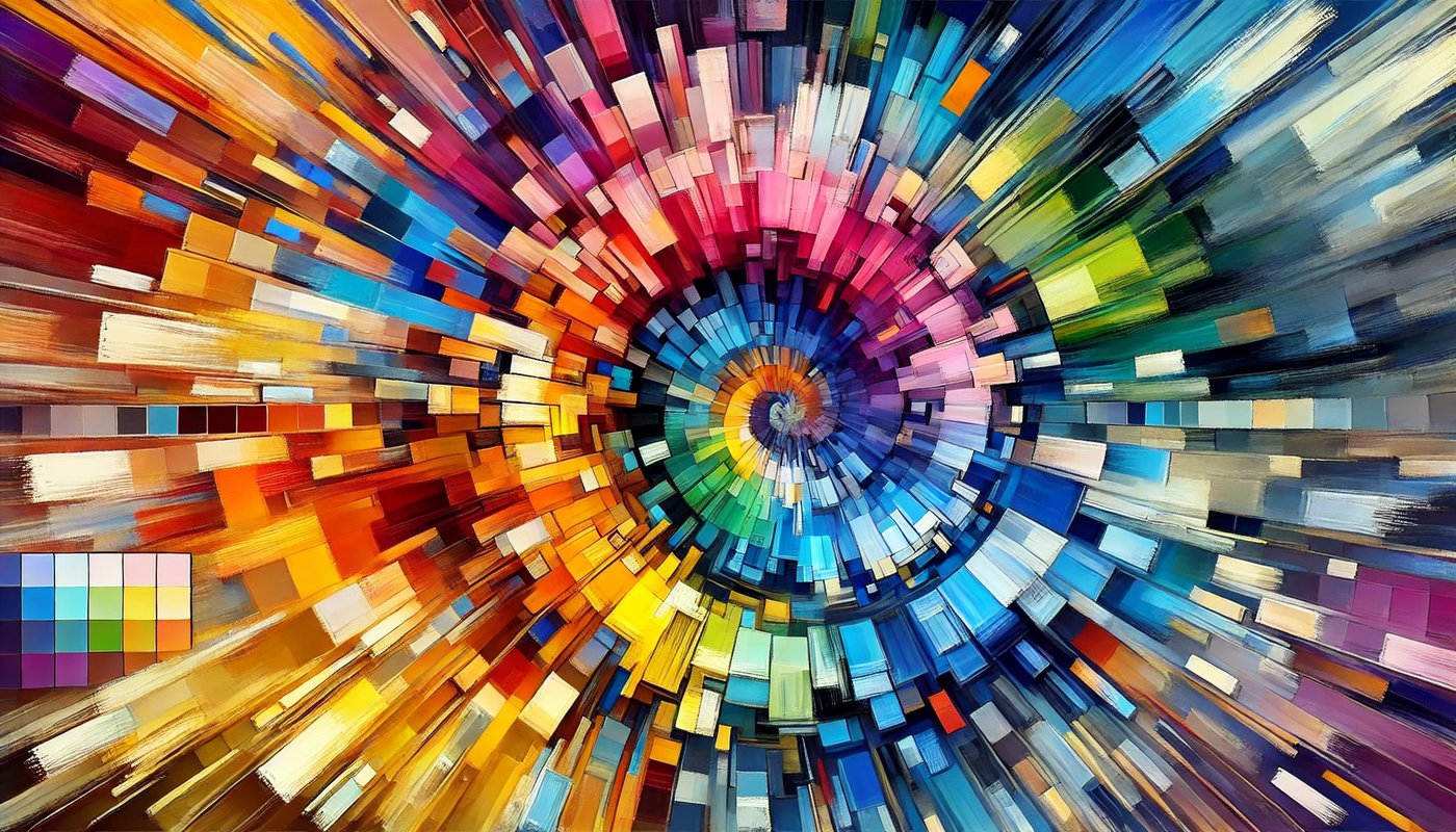
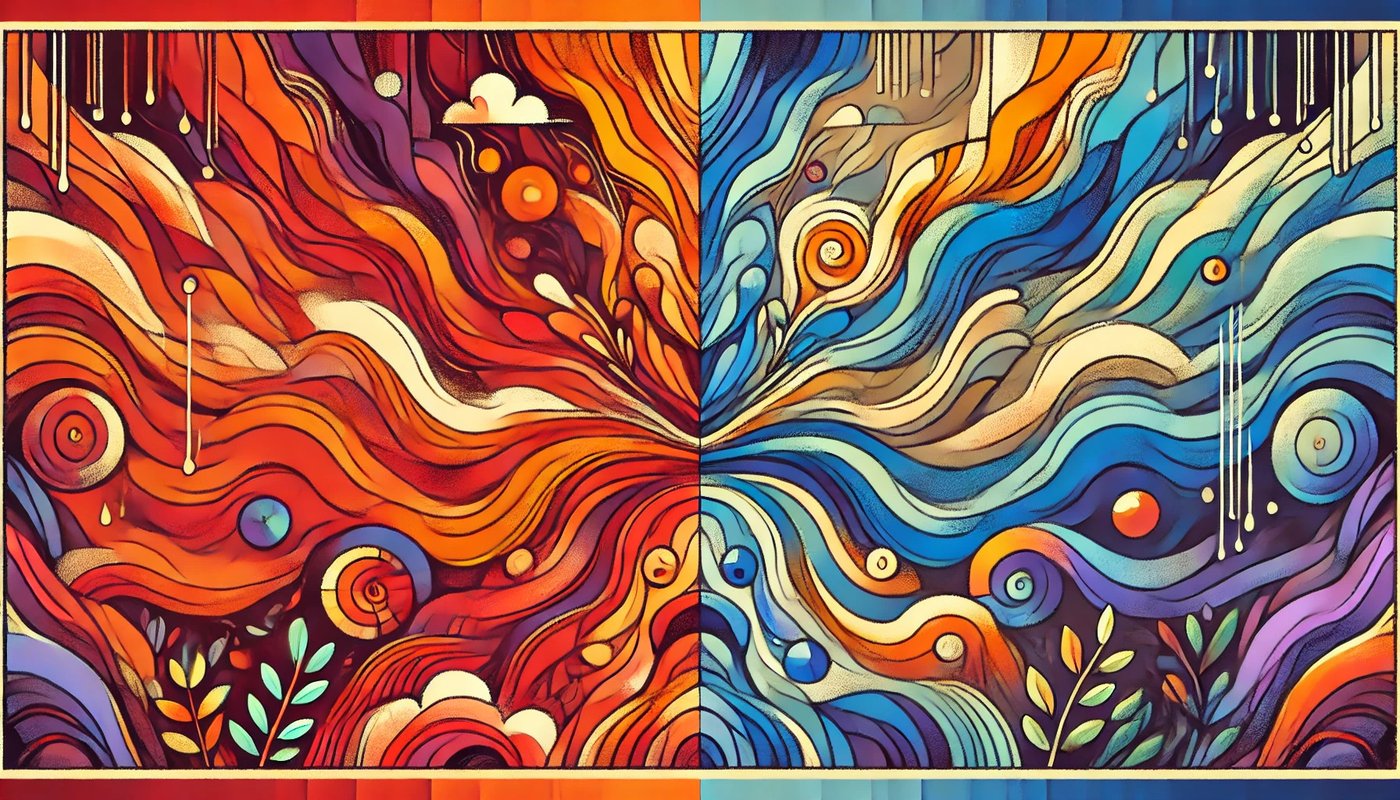
In the realm of color theory, colors are often classified based on their temperature into two main categories: warm and cool colors. Warm colors include hues like red, orange, and yellow, which evoke feelings of warmth, energy, and excitement. Cool colors, on the other hand, include hues like blue, green, and purple, which are associated with calm, relaxation, and tranquility. Understanding these classifications is crucial for artists, designers, and AI models to create emotionally impactful artworks.
Warm colors are reminiscent of sunlight and heat. They tend to advance in space, making objects appear closer and larger than they are. Red, for example, can evoke strong emotions such as passion, love, or anger. Orange can bring to mind the warmth of a sunset or autumn leaves, often conveying enthusiasm and creativity. Yellow, the color of sunshine, is generally perceived as cheerful and uplifting.
Cool colors, in contrast, are reminiscent of water, sky, and vegetation. They tend to recede in space, making objects seem further away. Blue is often associated with calmness, stability, and professionalism. Green, the color of nature, symbolizes growth, harmony, and freshness. Purple combines the calmness of blue and the energy of red, often evoking a sense of luxury and mystery.
AI models, particularly those designed for generating art, utilize color temperature to evoke specific emotional responses. These models are trained on extensive datasets of images, learning from the ways humans use warm and cool colors to convey different moods and atmospheres.
- Training on Emotional Datasets: AI models are trained on datasets that include a wide range of images labeled with emotional tags. These tags help the AI understand which color palettes are associated with which emotions. For instance, a dataset might include images of serene landscapes labeled as ‘calm’ and vibrant cityscapes labeled as ‘energetic’. By analyzing these examples, the AI learns to associate certain colors with specific emotional tones.
- Color Selection Algorithms: When generating an image, the AI selects colors based on the desired emotional impact. If the goal is to create a warm, inviting scene, the AI will choose colors from the warm spectrum. Conversely, if the goal is to create a calming, peaceful image, the AI will select cool colors. The algorithms take into account not just the colors themselves but also their intensity and placement within the composition to enhance the emotional effect.
- Application in Different Contexts: AI-generated art using color temperature can be applied in various contexts to evoke the desired emotional response. For instance, in advertising, warm colors might be used to draw attention and create a sense of urgency, while cool colors might be used to promote relaxation and trust in products like healthcare or financial services. In virtual environments and video games, color temperature can set the mood of a scene, making it feel more immersive and emotionally engaging.
- Balancing Warm and Cool Colors: Often, the most striking images combine both warm and cool colors to create a balanced composition. AI models are capable of learning how to balance these colors to enhance visual interest and complexity. For instance, a sunset scene might feature warm colors in the sky contrasted with cool shadows, creating a dynamic and visually appealing image.
Color Psychology and AI
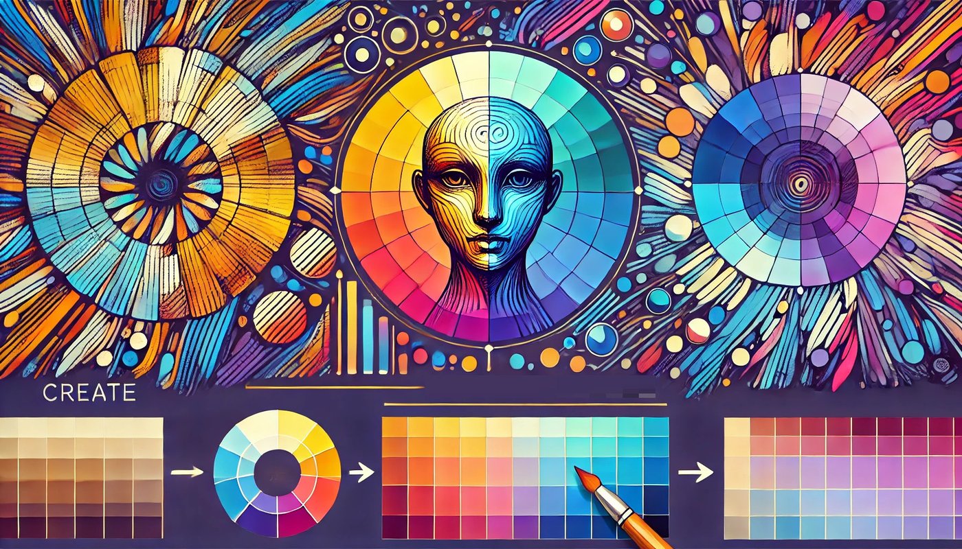
Color psychology explores how different colors affect human emotions and behaviors. This field of study highlights that colors can influence mood, perceptions, and even decision-making. In AI-generated art, understanding and applying color psychology can significantly enhance the viewer’s experience by evoking specific emotions and reactions through strategic color choices.
Different colors are known to have distinct psychological effects. For instance, red is often associated with excitement, passion, and urgency, while blue tends to evoke feelings of calm, trust, and stability. Yellow can bring about a sense of happiness and energy, while green is linked to growth, harmony, and safety. These associations, however, can vary depending on cultural contexts and individual experiences.
AI’s approach to utilizing color psychology involves training on large datasets that include images labeled with emotional and psychological responses. This training allows the AI to learn the general associations between colors and emotions. By analyzing these datasets, AI models can identify patterns and relationships, enabling them to predict and replicate the emotional impact of different color schemes in new artworks.
One way AI applies color psychology is through the generation of customized content tailored to evoke specific emotional responses. For example, an AI might be tasked with creating a series of calming images for a meditation app. In this case, it would likely use cool colors like blues and greens, which are known for their soothing effects. Conversely, for a fitness app aimed at energizing users, the AI might generate images dominated by vibrant reds and yellows to stimulate energy and motivation.
Additionally, AI’s ability to understand and apply color psychology enhances the viewer’s experience by creating more immersive and emotionally engaging art. By selecting colors that resonate with the intended emotional tone, AI-generated art can convey deeper meanings and connect more profoundly with viewers.
In advertising and marketing, AI uses color psychology to influence consumer behavior. For instance, by analyzing past successful advertisements, an AI can learn which color schemes are most effective at grabbing attention and encouraging purchases. It can then apply this knowledge to create new, visually compelling ads that are more likely to achieve the desired outcomes.
Overall, AI’s understanding and application of color psychology in art and design open new avenues for creating emotionally resonant and impactful visual content. By harnessing the power of color to influence emotions and behaviors, AI-generated art can provide more personalized and engaging experiences for viewers.
How AI Algorithms Ensure Harmonious Color Combinations
AI algorithms ensure harmonious color combinations by leveraging extensive datasets and sophisticated mathematical models. These algorithms are trained on vast collections of images and artworks, learning the principles of color theory and how different colors interact. Here’s how AI achieves this:
- Color Space Analysis: AI uses various color spaces, such as RGB and HSL, to understand and manipulate color properties. By analyzing these spaces, AI can identify harmonious color relationships and generate palettes that adhere to established color harmony principles.
- Pattern Recognition: Through deep learning, AI can recognize patterns in how colors are used in different contexts. By examining thousands of examples, AI learns to predict which colors will work well together and apply this knowledge to create balanced and aesthetically pleasing color schemes.
- User Inputs and Adjustments: Advanced AI tools allow users to input their preferences or constraints. The AI then generates color schemes that fit these criteria while ensuring harmony. This interactive approach enables artists and designers to explore various combinations and find the most suitable ones for their projects.
- Adaptive Learning: AI continuously improves its understanding of color harmony through feedback and new data. As more artworks are created and analyzed, AI refines its models to produce even better color combinations, keeping up with evolving trends and preferences.
In practice, these AI techniques are used in various applications, from digital painting and graphic design to fashion and interior design. By ensuring harmonious color combinations, AI enhances the visual appeal and emotional impact of art, making it more engaging and effective.
Saturation, Brightness, and AI Adjustments
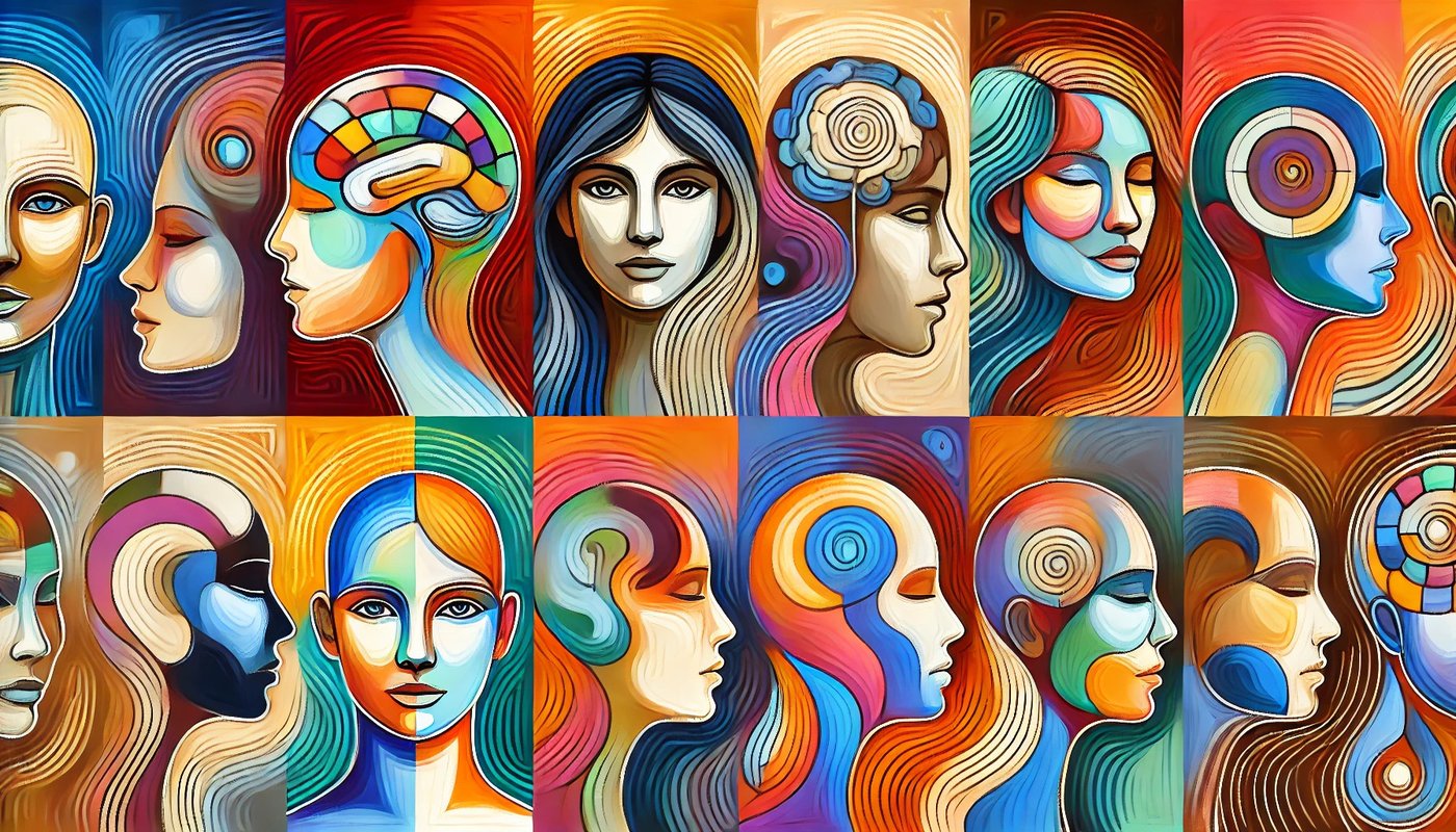
In traditional art, saturation refers to the intensity of a color, while brightness (or value) refers to how light or dark a color appears. High saturation means vivid, intense colors, while low saturation results in muted, grayish tones. Brightness, on the other hand, dictates how much light is present in the color, with higher brightness producing lighter colors and lower brightness producing darker ones.
In AI-generated art, adjusting saturation and brightness is crucial for achieving desired visual effects and enhancing the aesthetic quality of images. AI employs sophisticated algorithms to manipulate these aspects, ensuring that the resulting images are both visually appealing and contextually appropriate.
Understanding the fundamentals of saturation and brightness is essential for grasping how AI applies these concepts. Saturation involves the purity of a color. A highly saturated color contains no gray and is vibrant and pure, while a desaturated color appears more washed out or grayish. Brightness refers to the lightness or darkness of a color. These properties are essential in creating mood, emphasis, and visual interest in artwork.
Artists have historically used variations in saturation and brightness to create depth, focus, and mood. For example, a landscape painting might use brighter, more saturated colors in the foreground to draw attention and muted colors in the background to create a sense of distance.
AI models adjust saturation and brightness using several methods:
- Image Processing Techniques: AI employs techniques like histogram equalization, which adjusts the brightness levels to improve contrast. For saturation adjustments, algorithms can enhance or reduce color intensity based on the desired outcome.
- Neural Networks: Convolutional neural networks (CNNs) are trained to recognize and adjust color properties. During training, the AI learns from vast datasets how different saturation and brightness levels affect the overall image quality.
- Generative Models: Models like GANs (Generative Adversarial Networks) can be specifically trained to modify color properties. The generator creates images with varying saturation and brightness, while the discriminator evaluates them to ensure they meet the desired criteria.
Real-World Advances in AI-Generated Imagery
AI’s ability to adjust saturation and brightness has numerous practical applications:
- Photography: AI-powered photo editing tools can automatically enhance images by adjusting brightness and saturation, making photos more vibrant and visually appealing.
- Digital Art: Artists can use AI to quickly adjust the color properties of their digital artwork, experimenting with different looks and moods without manually tweaking each element.
- Video Production: AI can enhance the color properties of video frames, ensuring consistent brightness and saturation across scenes, which is particularly useful in post-production.
For example, Adobe Photoshop uses AI-based tools to adjust saturation and brightness, allowing photographers and designers to enhance images effortlessly. AI systems analyze the image content and suggest optimal adjustments, making the editing process faster and more intuitive.
Future Directions: The Evolving Relationship Between Color Theory and AI Art
The integration of color theory into AI-generated art is continually evolving, with exciting future possibilities for both fields. As AI technology advances, the ability to create art that utilizes sophisticated color theory principles is becoming increasingly refined, leading to more nuanced and emotionally resonant works.
AI’s role in art creation is set to expand dramatically. Future AI systems will likely incorporate more advanced color theory principles, enabling them to produce art that is not only aesthetically pleasing but also emotionally powerful and contextually appropriate. As AI models become more sophisticated, they will be able to experiment with color in ways that mimic and even surpass human capabilities.
- Enhanced Personalization: One of the most promising areas of development is the ability of AI to personalize color schemes based on individual preferences and psychological profiles. By analyzing user data, AI could tailor color palettes to evoke specific emotional responses or to align with personal tastes, making AI-generated art more personalized and impactful.
- Dynamic Color Adjustments: AI will likely gain the ability to make real-time color adjustments in response to environmental changes or user interactions. For instance, an AI-generated artwork displayed in a room could adjust its color scheme based on the time of day or the lighting conditions, ensuring that the artwork always looks its best.
- Interactive Color Experiences: Future AI systems may enable interactive color experiences where users can alter the color scheme of a piece of art through gestures or voice commands. This interactivity could lead to more engaging and immersive art experiences, allowing users to become co-creators in the artistic process.
Potential Advancements in AI’s Understanding of Color
Advancements in AI’s understanding of color will be driven by both improvements in machine learning algorithms and the availability of more comprehensive and diverse training datasets. Here are some key areas where we can expect significant progress:
- Deeper Semantic Understanding: AI models will develop a deeper semantic understanding of color, recognizing not just the RGB values but also the contextual and cultural significance of different colors. This means AI could generate art that aligns more closely with human cultural and emotional associations with color.
- Advanced Color Harmonization: Future AI systems will employ more sophisticated techniques for color harmonization, ensuring that the colors used in an artwork complement each other in a way that is both visually appealing and emotionally resonant. This could involve the use of advanced mathematical models to predict and apply color harmony principles more effectively.
- Integration with Other Modalities: AI will become better at integrating color with other modalities such as texture, shape, and sound. This multimodal approach will allow for the creation of richer, more complex artworks that engage multiple senses simultaneously.
- Predictive Color Analytics: AI could use predictive analytics to anticipate future color trends and incorporate them into its creations. By analyzing current and historical data on color usage in various fields (such as fashion, interior design, and digital media), AI could generate art that is ahead of the curve in terms of color trends.
- Collaborative Creativity: AI will increasingly act as a collaborator with human artists, providing suggestions for color choices and adjustments that enhance the overall aesthetic quality of the work. This collaborative approach will leverage the strengths of both human intuition and AI precision.
Concluding Thoughts
The integration of color theory with AI-generated art presents a fascinating intersection of traditional artistic principles and modern technological advancements. As AI continues to evolve, it enhances our understanding and application of color in creative processes, pushing the boundaries of what is possible in digital art.
In this exploration, we have delved into various aspects of color theory and its application in AI art, including the basics of primary, secondary, and tertiary colors, the use of the color wheel, and advanced color concepts like color harmony, saturation, and brightness adjustments. AI’s ability to learn and apply these principles has opened new avenues for creativity and innovation in art.
Major Takeaways
- AI and Primary Colors: AI models learn to generate and blend primary colors through extensive training on diverse datasets.
- Color Wheel in AI: AI utilizes the color wheel to create harmonious and aesthetically pleasing images by understanding color relationships.
- Analogous Colors: AI identifies and applies analogous color schemes to enhance the visual appeal of generated art.
- Color Temperature: AI uses warm and cool colors to evoke specific emotional responses in viewers.
- Color Psychology: AI applies principles of color psychology to enhance the viewer experience by selecting colors that evoke desired emotions.
- Advanced Color Harmony: AI algorithms ensure harmonious color combinations by applying principles like triadic and split-complementary schemes.
- Saturation and Brightness Adjustments: AI adjusts saturation and brightness to improve the quality and visual impact of generated images.
- Future Directions: AI’s evolving understanding of color will continue to drive innovation in art creation, personalization, and interactive experiences.
